
Parking payment kiosk design
Five industrial design directions and a set of functional concepts for a new CardPark payment kiosk targeting the upper-midrange and premium market segments. From a distinctive visual identity to product features designed to create meaningful competitive advantages.
Design — Konstantin Gardeev

Challenge:
Develop several industrial design directions for a new CardPark parking payment kiosk positioned in the upper-midrange and premium market segments. Our objective was not limited to creating a new visual identity. We also aimed to identify functional improvements that could support the product’s market positioning and offer tangible advantages over competing solutions.
A parking payment kiosk is a complex product that combines urban equipment, payment infrastructure and a user interface. Our concept exploration therefore covered not only enclosure architecture and visual language, but also environmental protection, user interaction, maintenance access and everyday operation.
Solution:
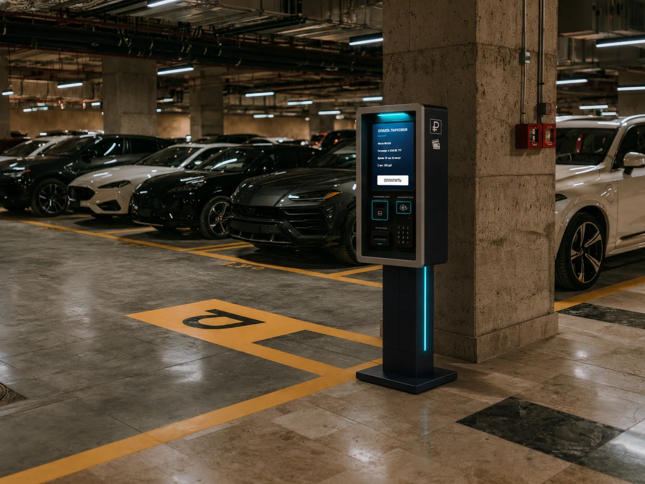
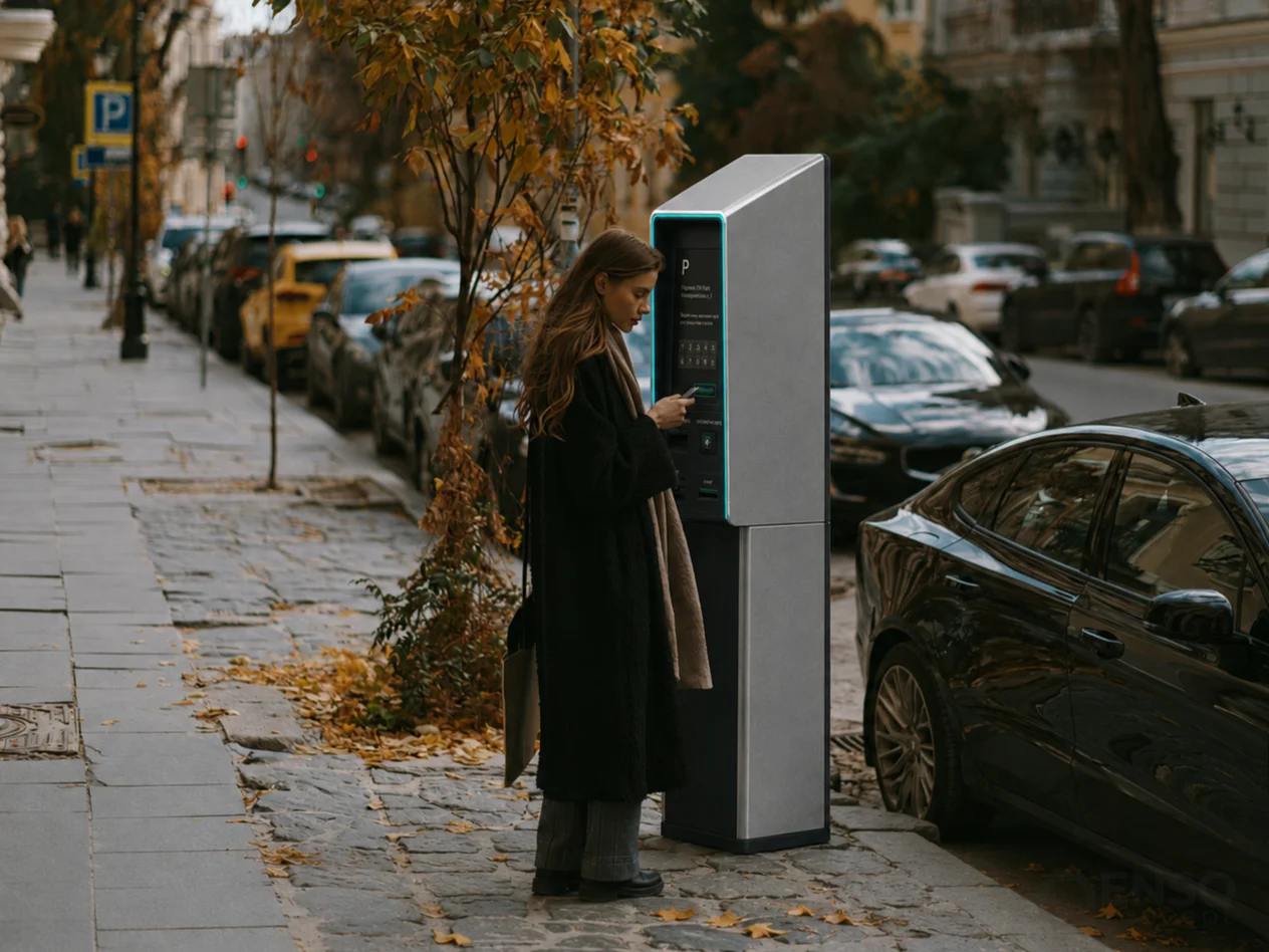
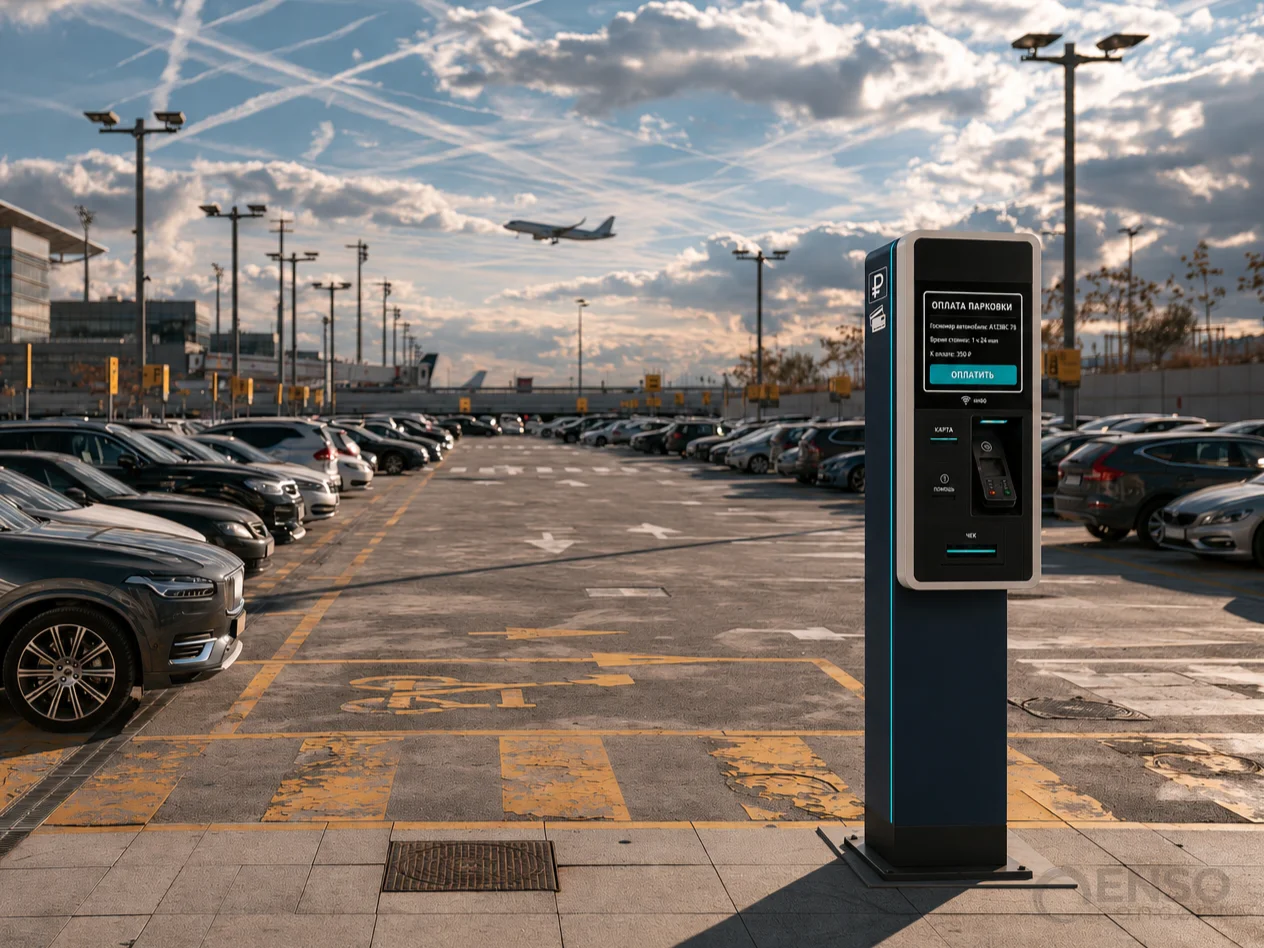
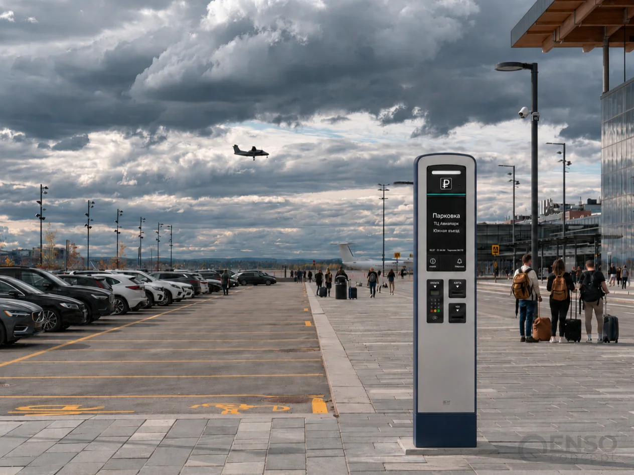
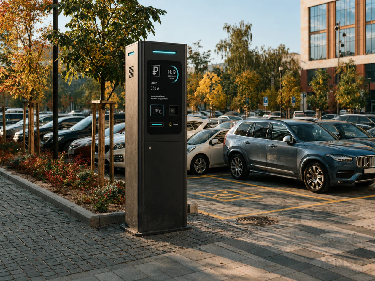
Rather than immediately focusing on a single universal design, we developed five independent concept directions. Each explores a different approach to enclosure architecture, interface configuration, environmental protection and integration into urban surroundings.
In parallel, we investigated opportunities for functional development: features that could go beyond visual improvements and help establish a stronger competitive proposition for the new product.
Concept 01:
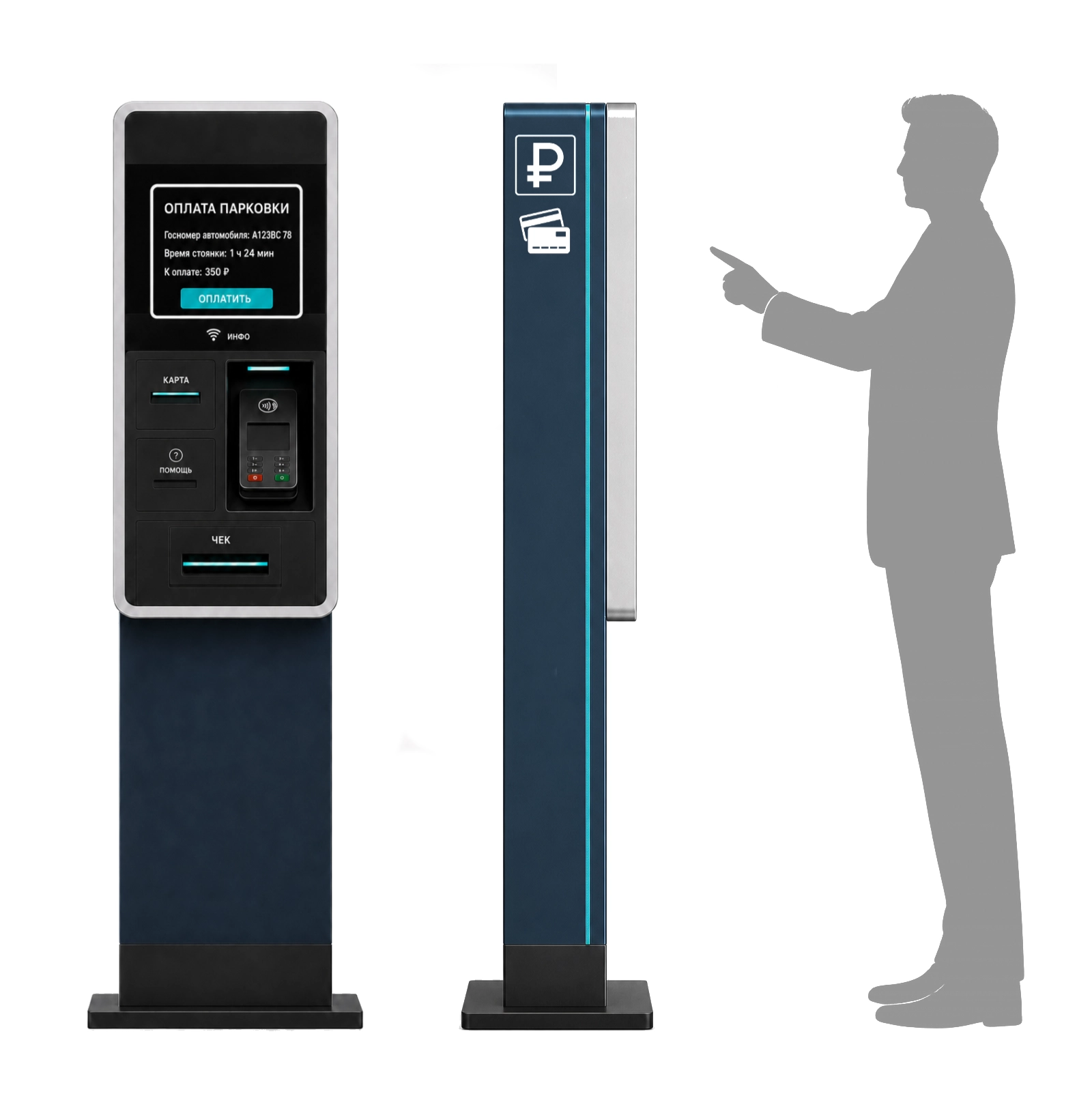
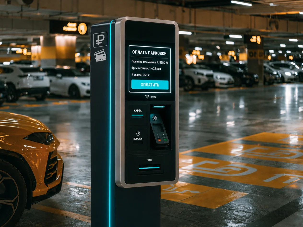
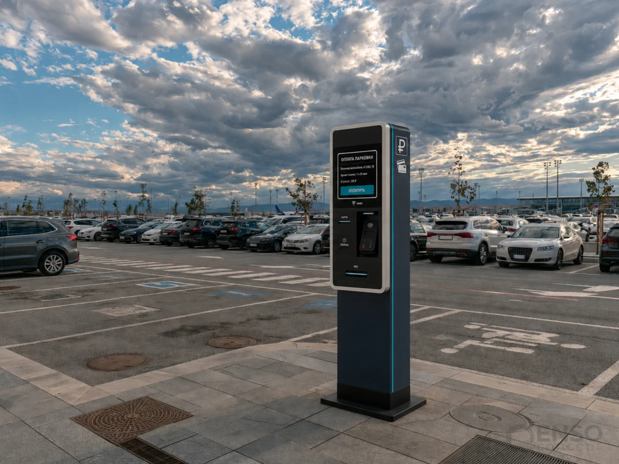
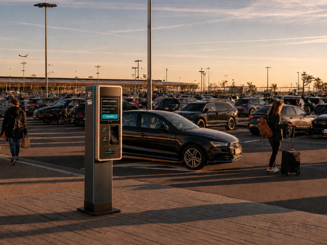
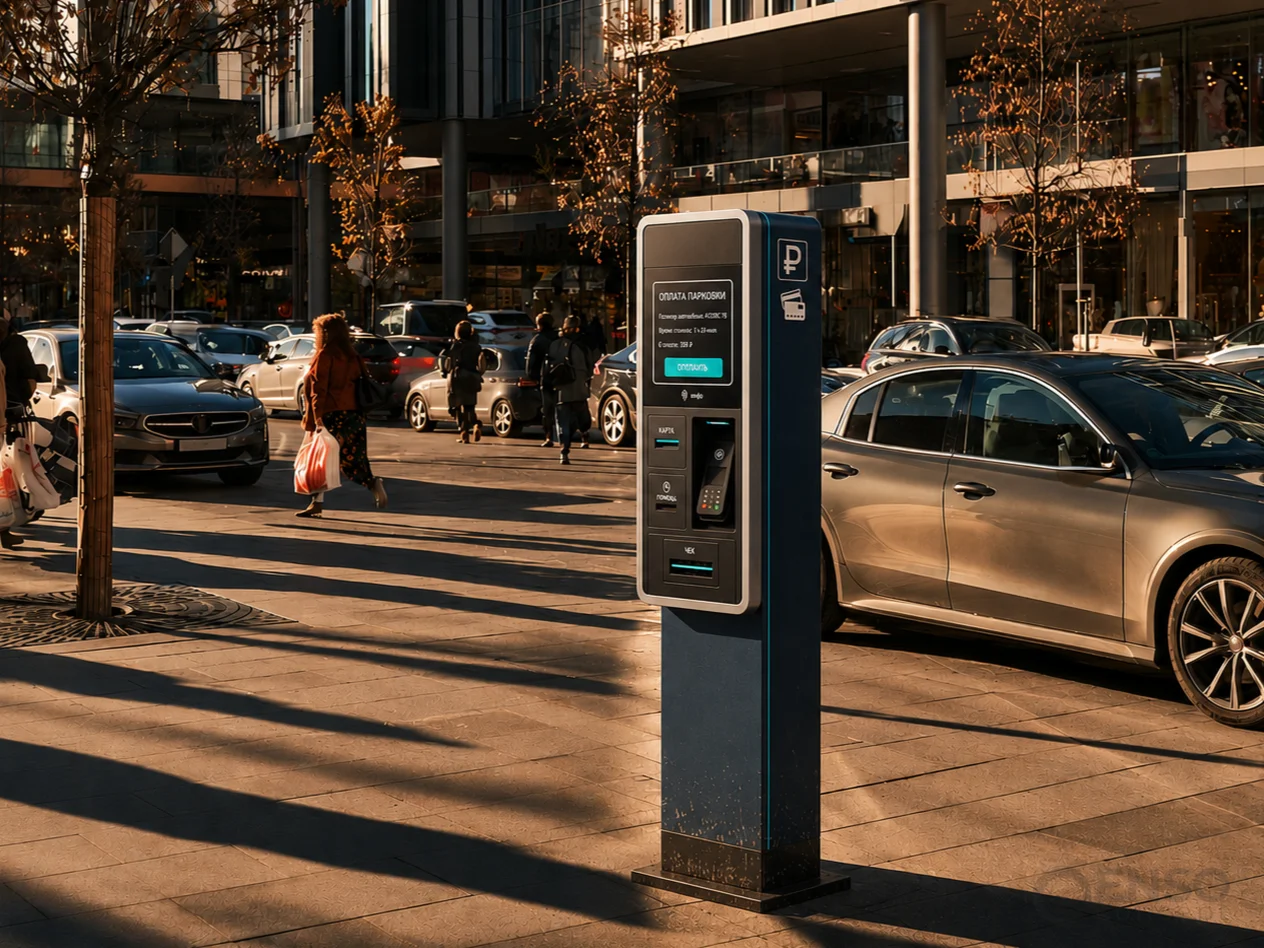
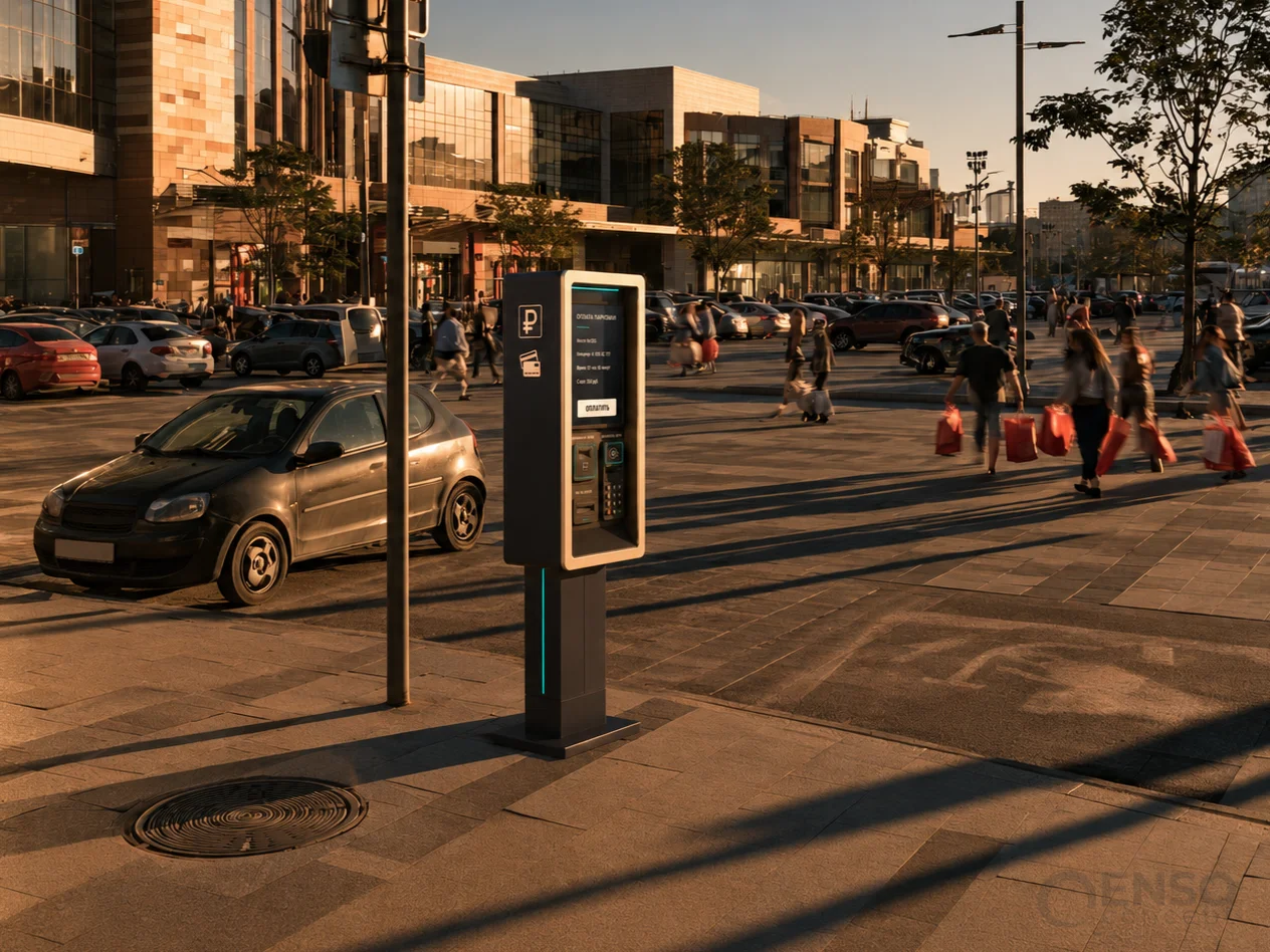
Our first direction separates the interface module from the main supporting pylon, turning it into an independent architectural element. This approach creates a visually lighter enclosure, maintains a slim profile and establishes a distinctive, easily recognisable side silhouette.
The electronic and payment components are integrated into a single front-facing module with a contrasting aluminium-look frame. An additional vertical light strip helps users identify the kiosk from a distance, particularly at dusk or in poorly illuminated parking facilities.
Concept 02:
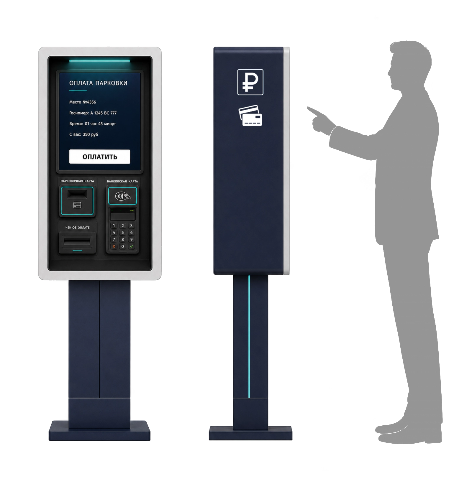
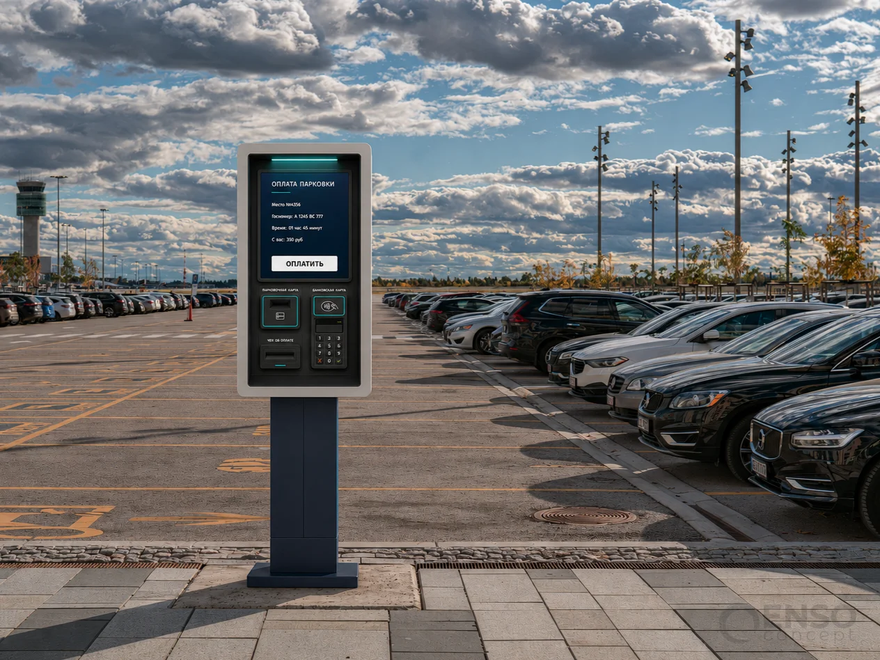
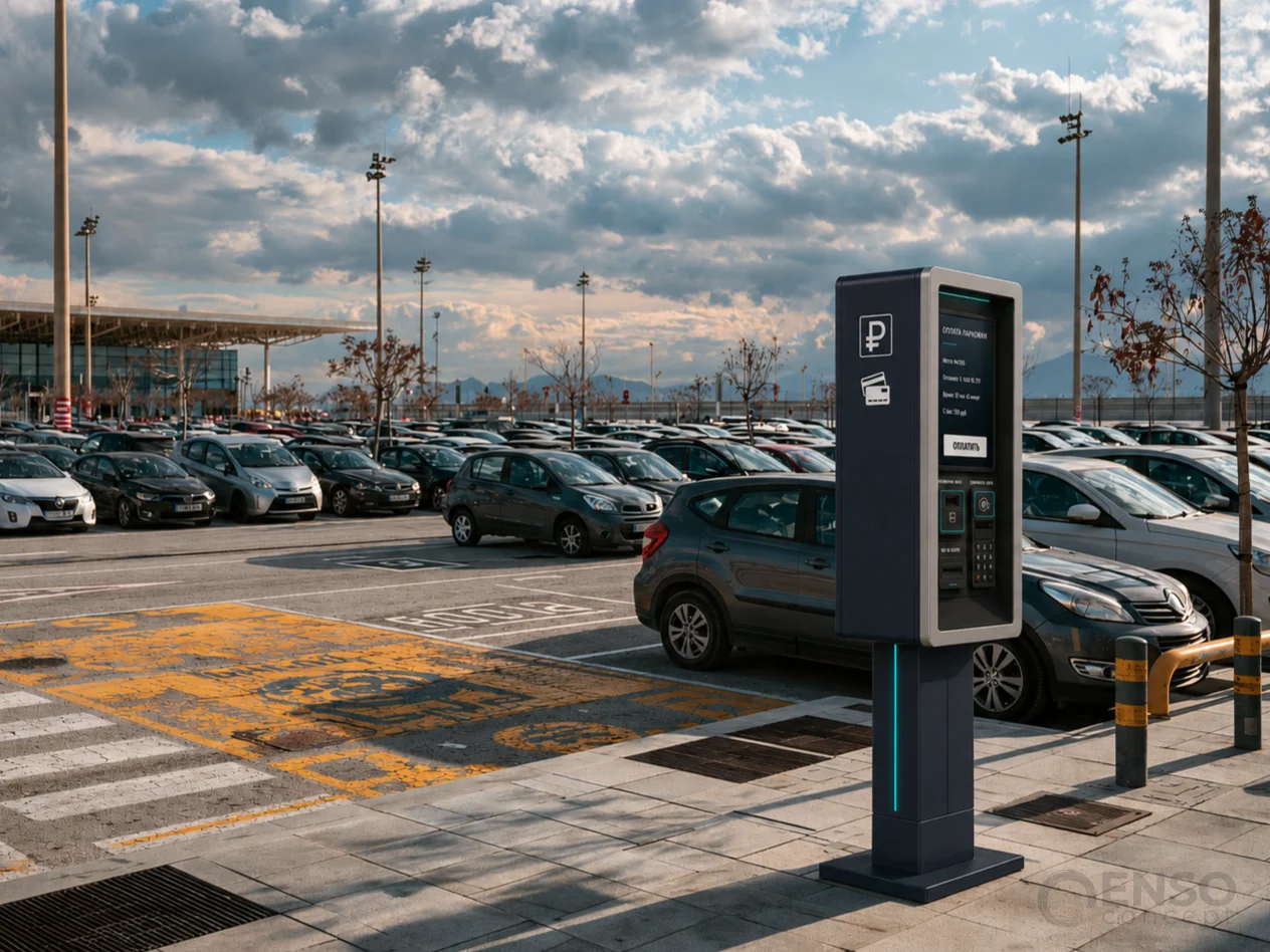
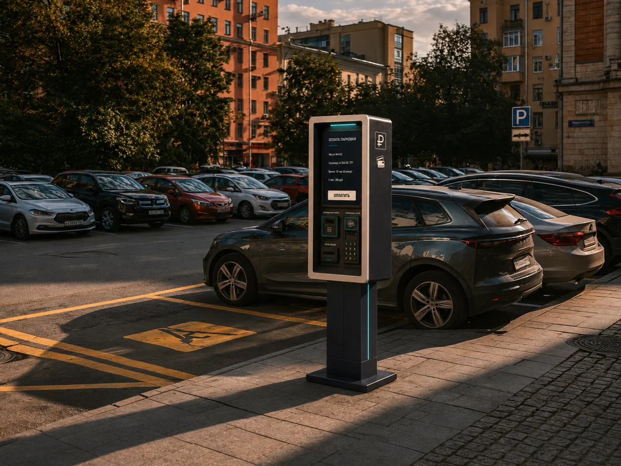
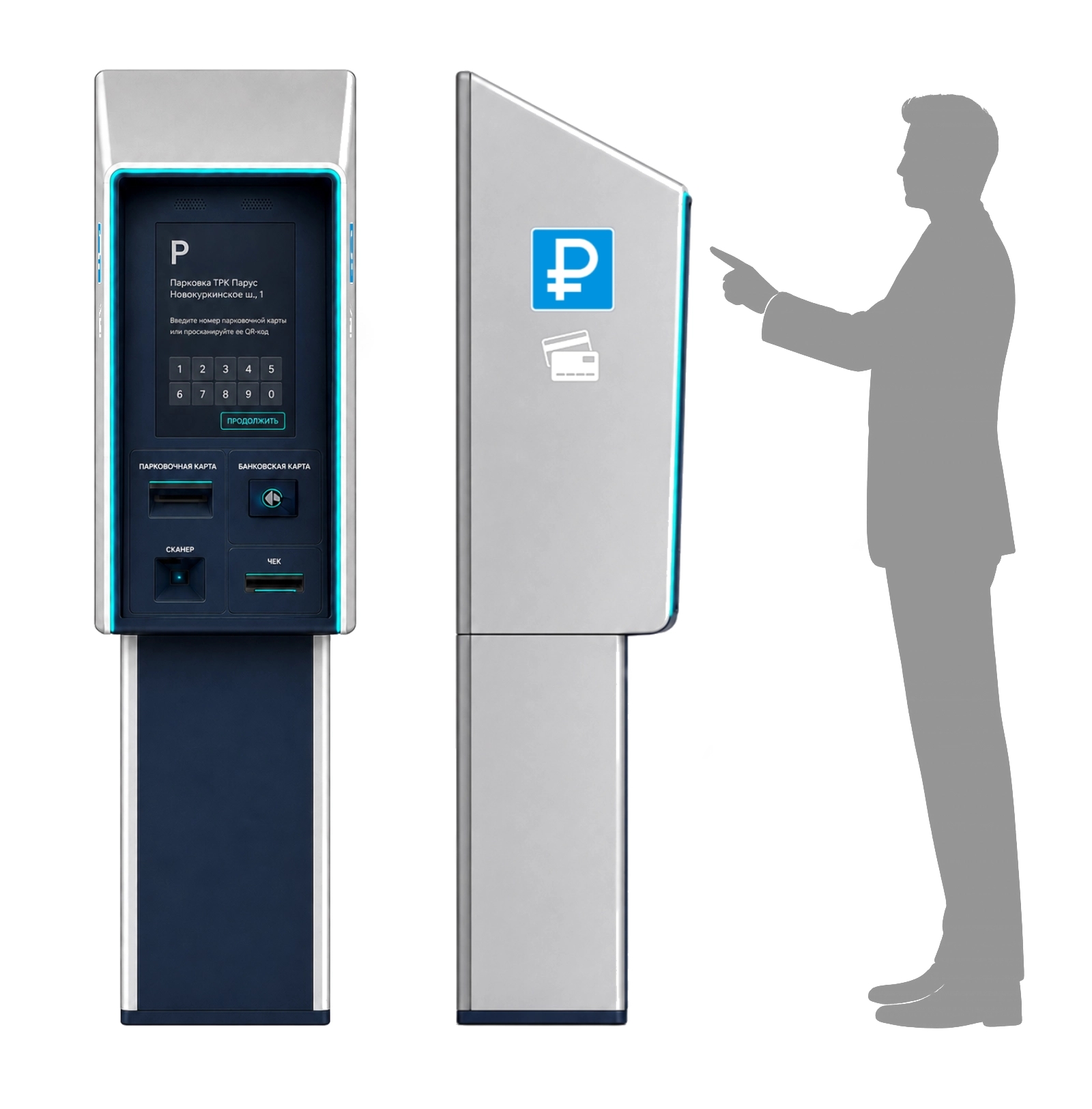
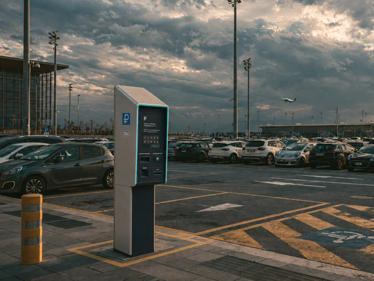
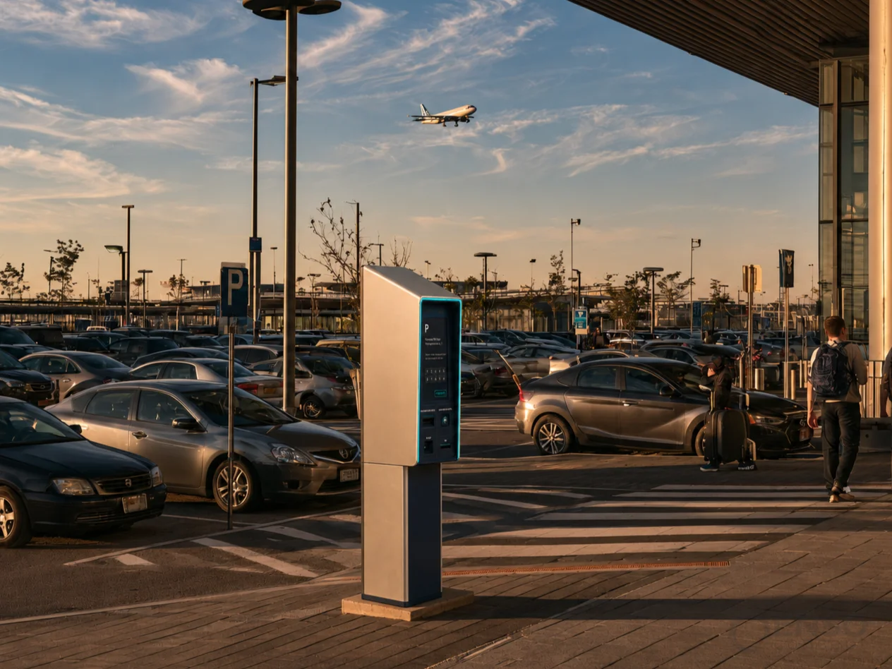
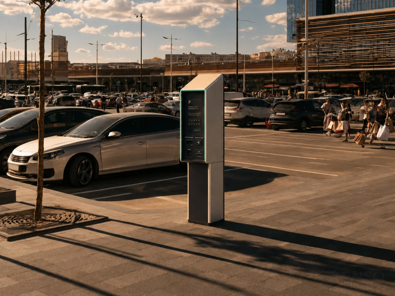
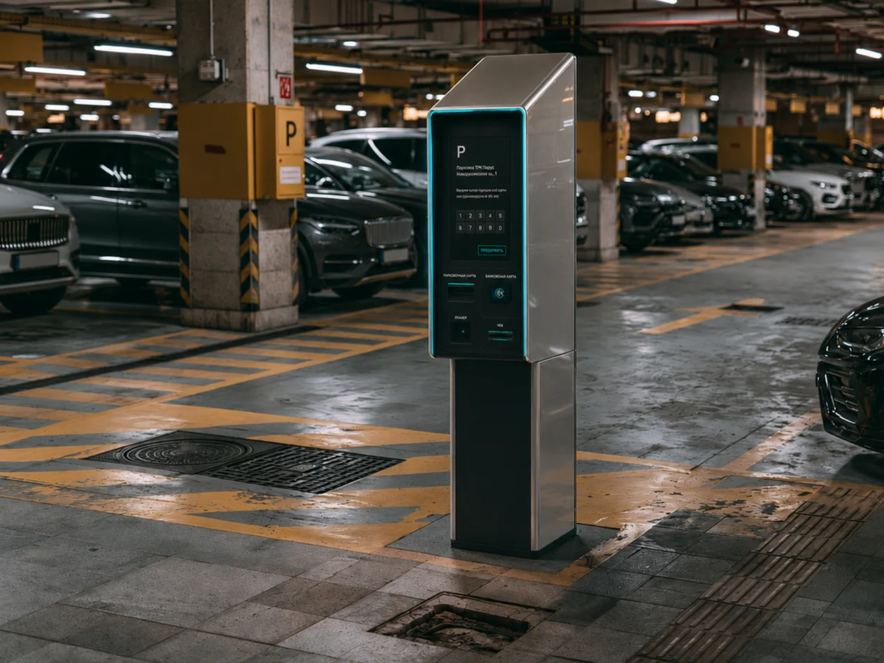
The second direction builds upon the conventional box-on-pylon configuration, introducing one significant difference: the entire interaction area is recessed into the enclosure and surrounded by a pronounced protective frame. Beyond adding architectural depth to the front panel, this geometry provides partial shielding against crosswinds, driving rain and snow, helping protect the display and payment hardware.
Integrated lighting at the top of the recess illuminates the interaction area while creating a subtle visual accent. Key controls are additionally highlighted using the brand colour. In this concept, enclosure geometry serves aesthetic, protective and functional purposes simultaneously.
Concept 03:
The third concept continues our exploration of protected interfaces, introducing a softer and more sculptural enclosure. The interaction area is positioned inside a partially recessed niche with a pronounced upper canopy, while the lower section remains open. The resulting wraparound silhouette makes a subtle reference to traditional public telephone booths, where the enclosure itself creates a sheltered space for the user.
The contrast between the light exterior and the deep-blue interface panel emphasises the geometry. An illuminated contour visually connects the elements and helps define the main interaction area.
Concept 04:
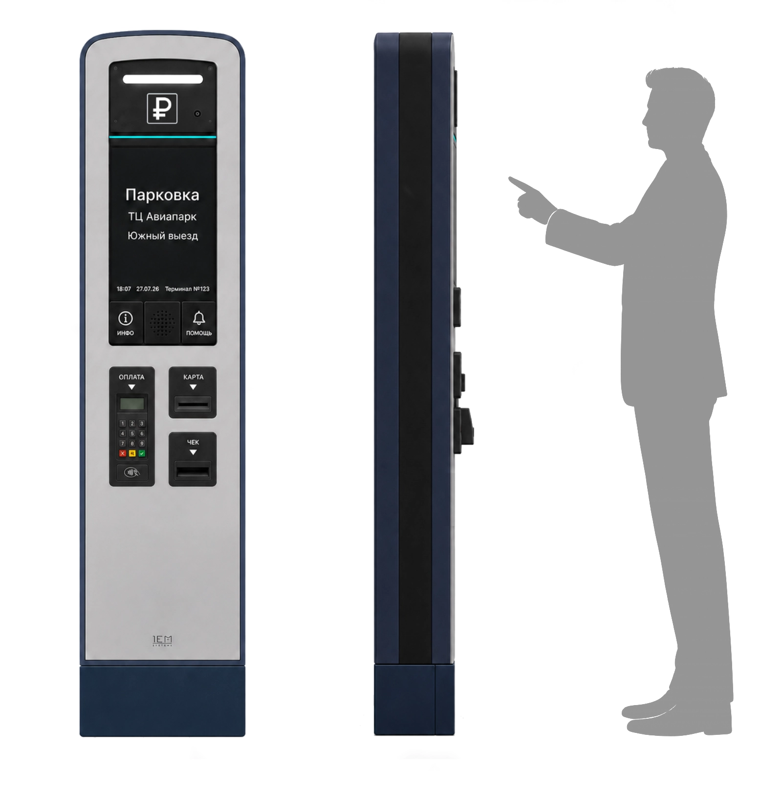
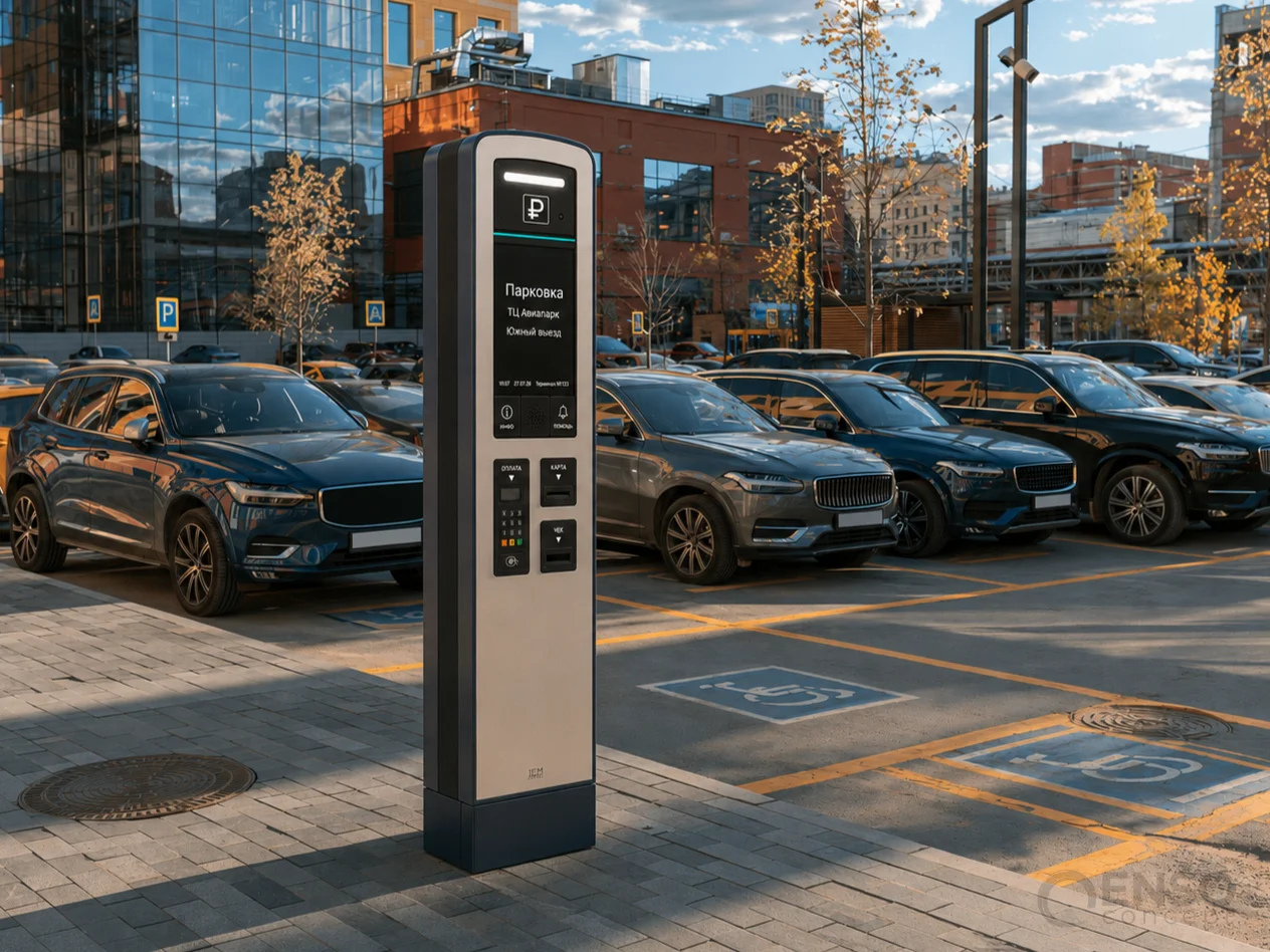
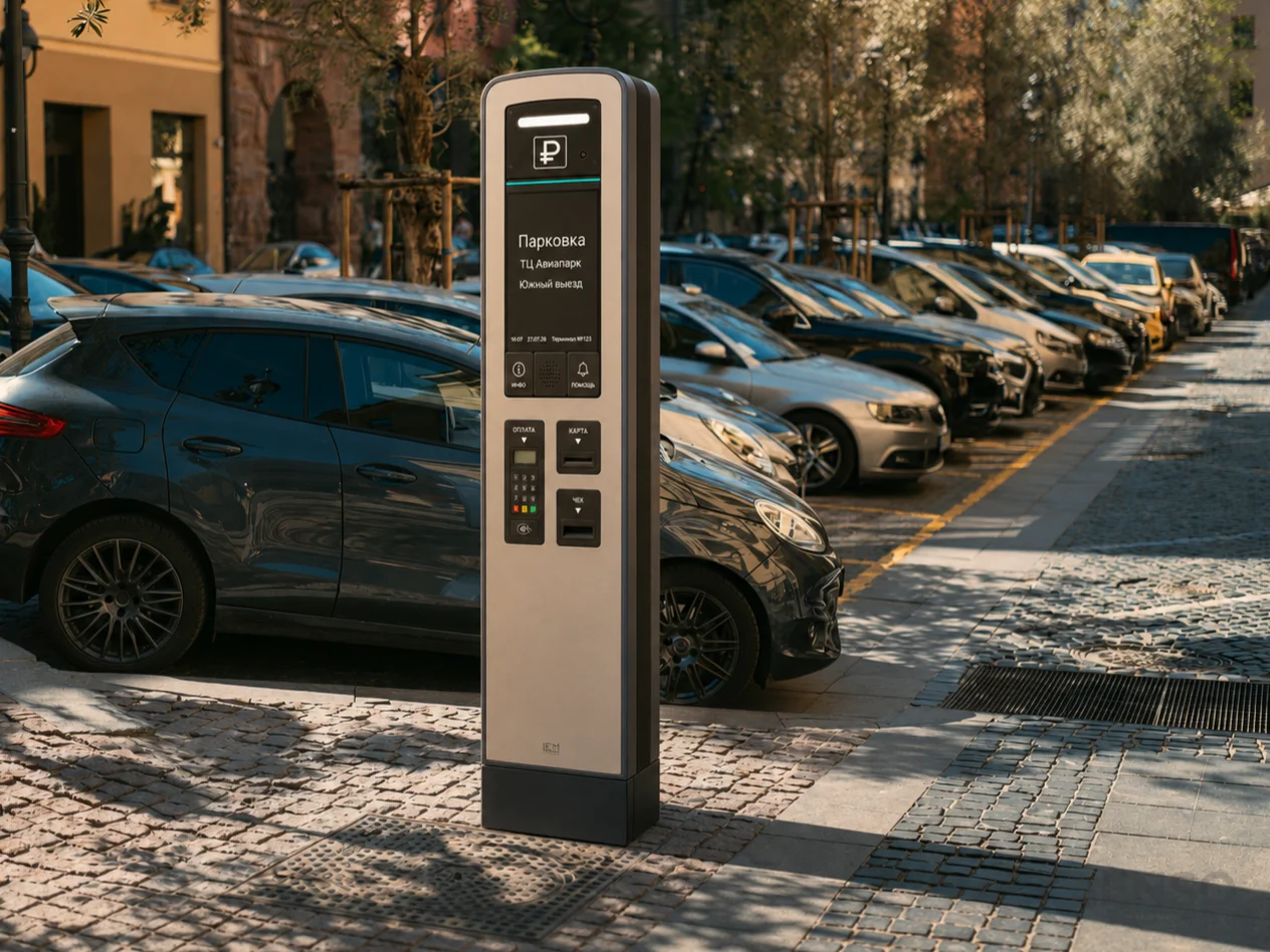
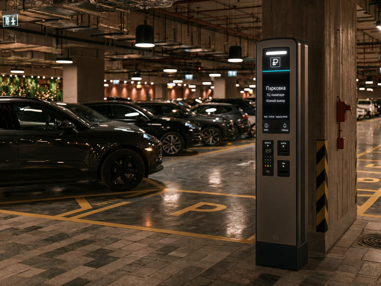
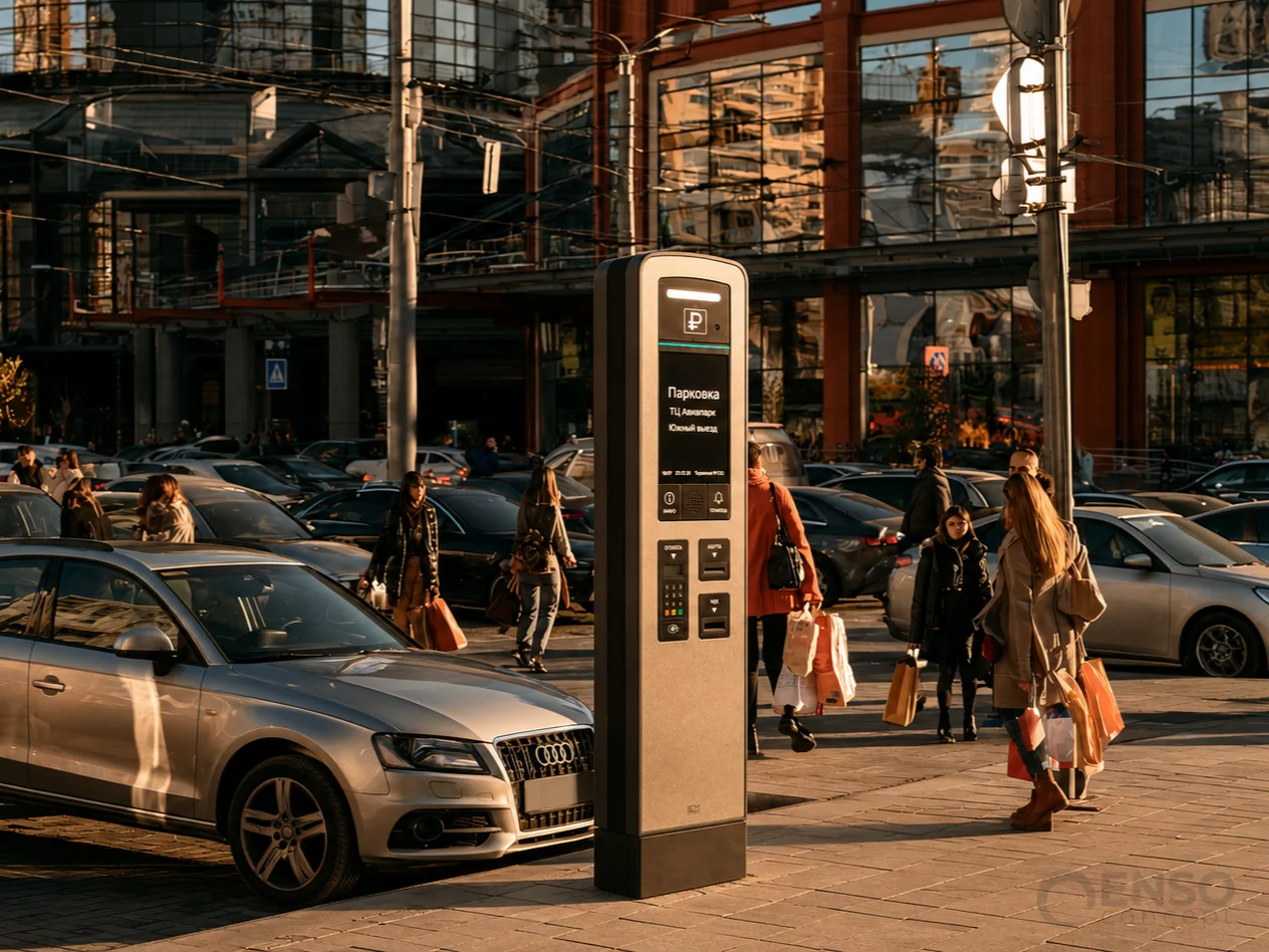
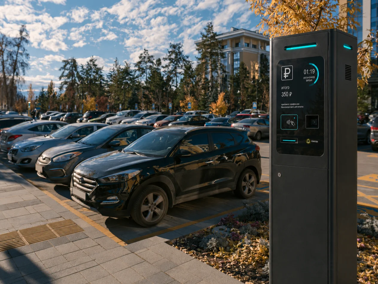
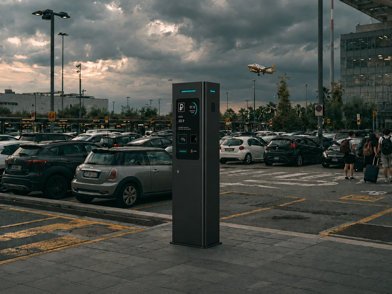
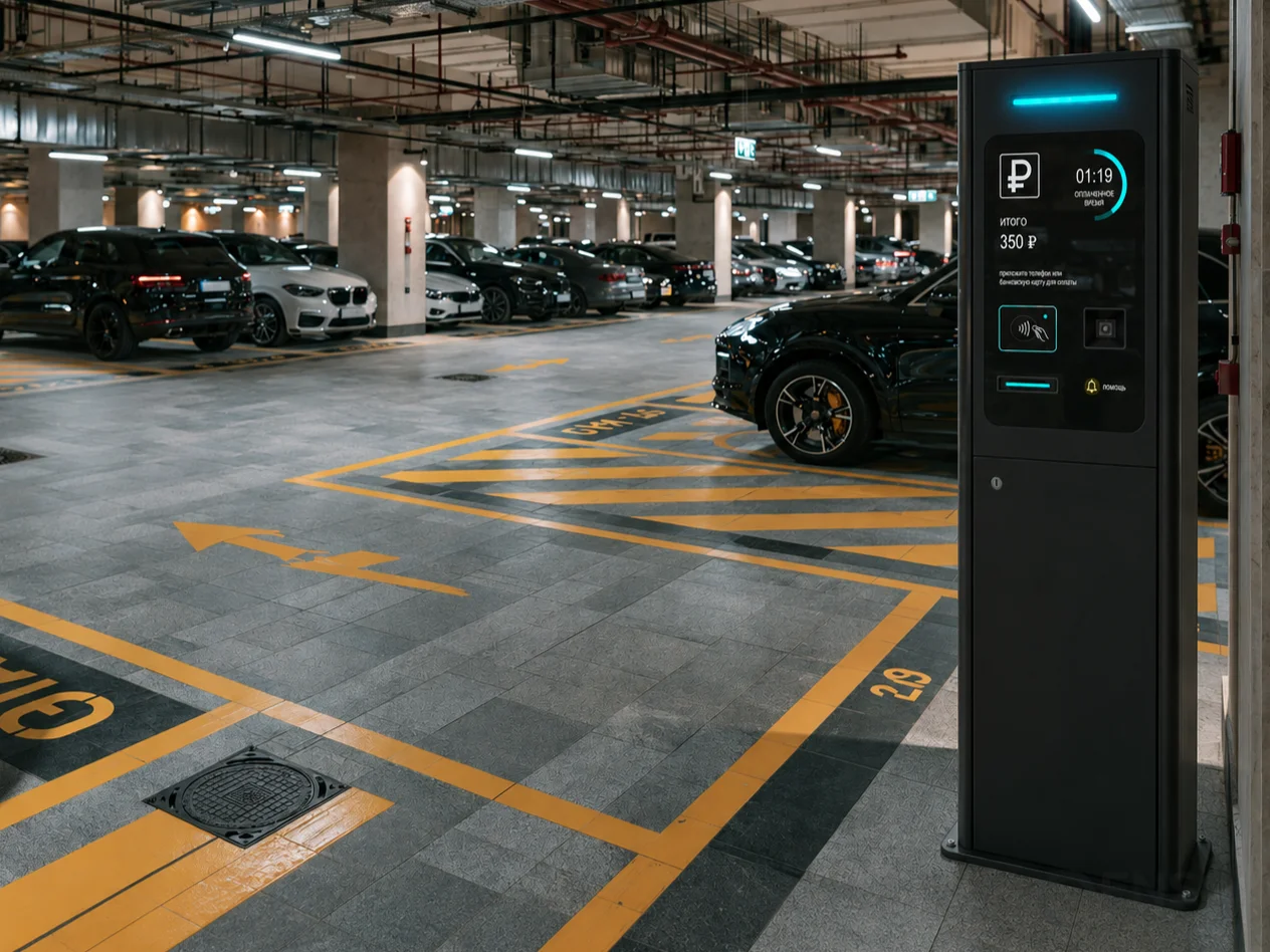
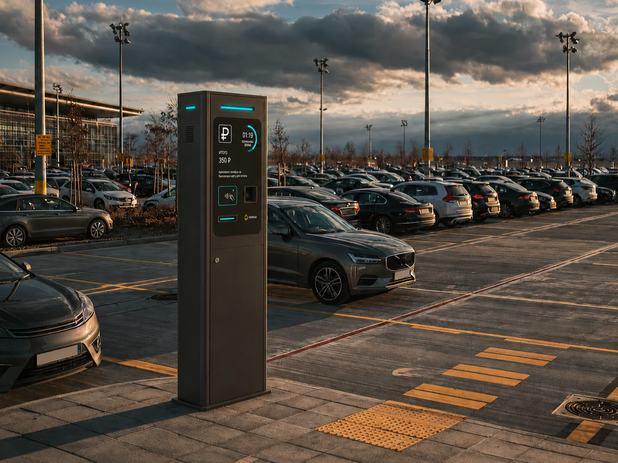
For the fourth direction, we took the opposite approach and simplified the product architecture as much as possible. A slender vertical pylon, gently rounded top and minimal protruding elements create a restrained, almost architectural appearance that can integrate naturally into a variety of urban environments. The display, payment terminal and receipt dispenser form a unified vertical composition, while the compact footprint makes the kiosk suitable for locations with limited available space.
Here, our focus was on proportions and visual integrity: how expressive can an industrial product remain when almost every unnecessary detail is removed? This restrained visual language also reflects a broader tendency we have observed in contemporary urban infrastructure.
Concept 05:
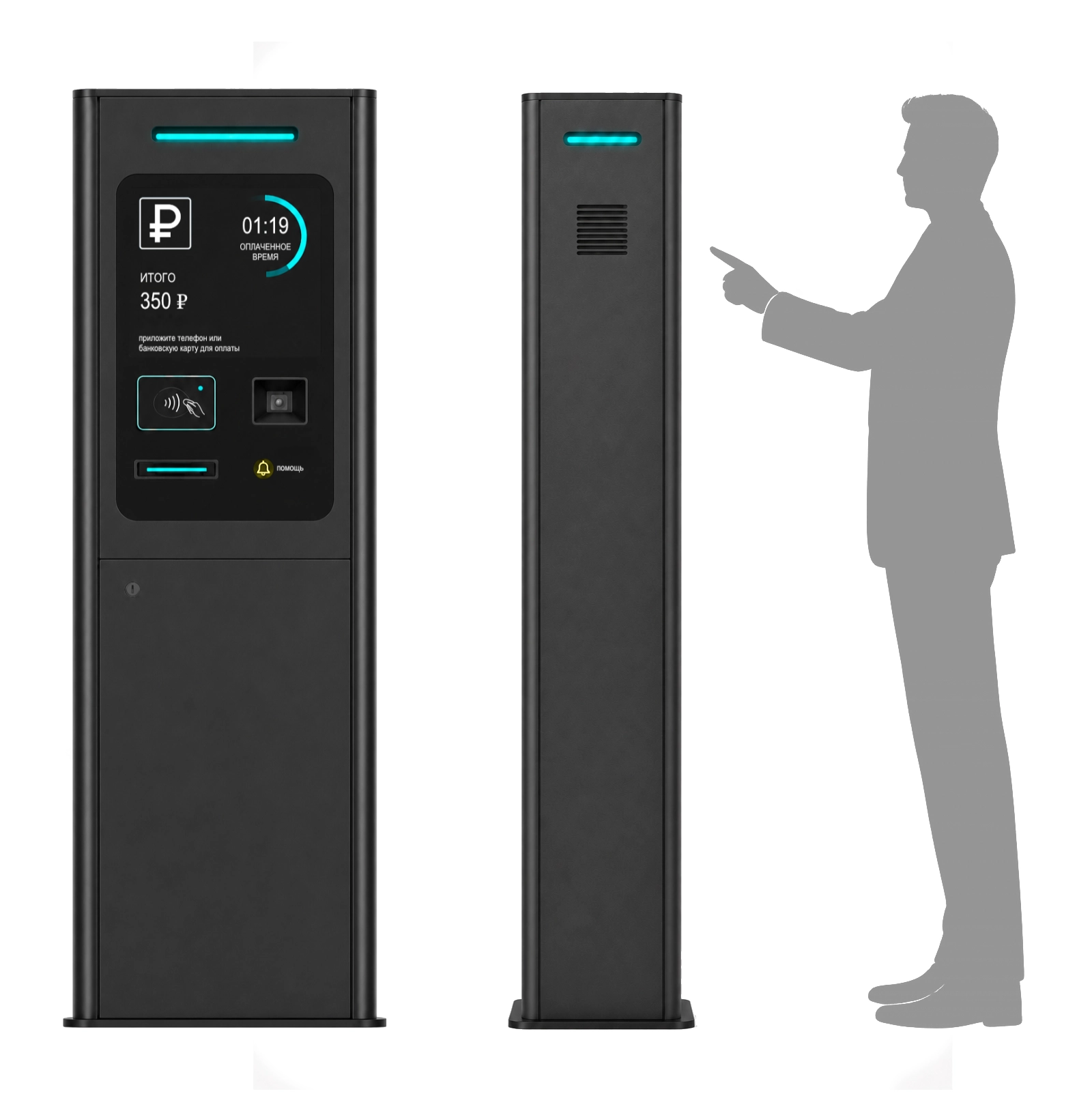
The final direction further develops the monolithic enclosure, bringing all primary interaction elements together behind a single front surface. Instead of using multiple individual frames, openings and overlays, we proposed a unified vandal-resistant glass front panel incorporating the display and main interaction components.
This creates a clean, visually organised interface and simplifies the cleaning of the front surface. The enclosure also allows for different manufacturing approaches, including aluminium profiles or fabricated sheet-metal side panels.
Product Insights:
During the concept development process, we identified an additional set of functional opportunities that could be implemented independently of the selected industrial design direction. Some address environmental protection and potentially lower maintenance costs. Others focus on improving the user experience through more intelligent interface organisation and lighting.
These concepts represent potential product differentiators that, following further validation, could strengthen CardPark’s positioning in the upper-midrange and premium market segments.
01. Interface Protection Against Precipitation
Recessing the interaction area allows the enclosure geometry itself to contribute to environmental protection. The side walls and upper canopy partially shield the display and payment components from wind-driven rain and snow. Rather than relying exclusively on additional covers and attachments, the protective function becomes an integral part of the product architecture.
02. Protection Against Mechanical Damage
Parking kiosks installed near entrance and exit lanes are exposed to the risk of accidental contact with vehicles. When a glass panel occupies the entire front surface, even a relatively minor collision may result in costly repairs. A recessed interface surrounded by a raised protective frame could reduce the likelihood of direct contact with the glass during minor glancing impacts.
We also proposed mounting the glass panel using an elastic sealing gasket, avoiding rigid glass-to-metal contact. This approach is not intended to replace dedicated impact protection in a serious collision. However, it offers a potential way to protect the most vulnerable interface components against minor accidental contact.
03. User Interaction Sequence
Lighting can become more than a decorative feature. It can function as an integral part of the user interface. By highlighting the active interaction areas sequentially — scanning the parking card, making a payment and collecting the receipt — the kiosk can guide users naturally from one action to the next.
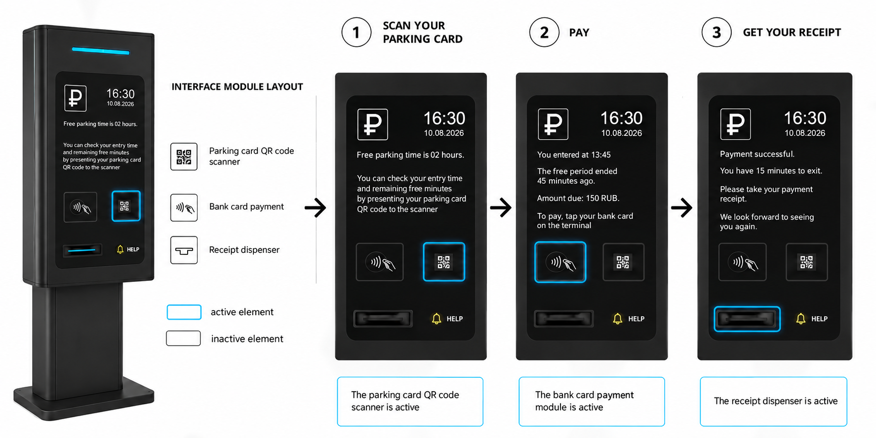
Instead of illuminating every available component simultaneously, we propose highlighting only the element required at the current stage. Lighting should not display every available function. It should indicate the next action.
04. Adaptive Interface Lighting
While working on this project, we noticed a recurring usability problem in existing public payment terminals. Our field observations of ticketing machines in the Moscow Metro revealed a striking contrast between excessively bright displays, brightly illuminated interaction areas and poorly lit keypads.
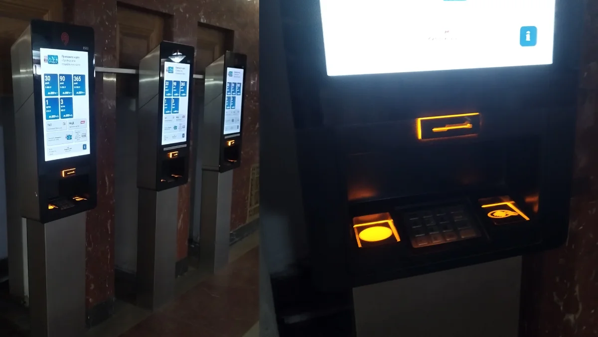
When users shift their gaze from a bright screen to the darker control panel, several equally illuminated elements compete for their attention. Instead of providing clear visual guidance, the lighting can make the interaction more confusing. This observation prompted us to propose an adaptive interface lighting system built around two complementary principles.
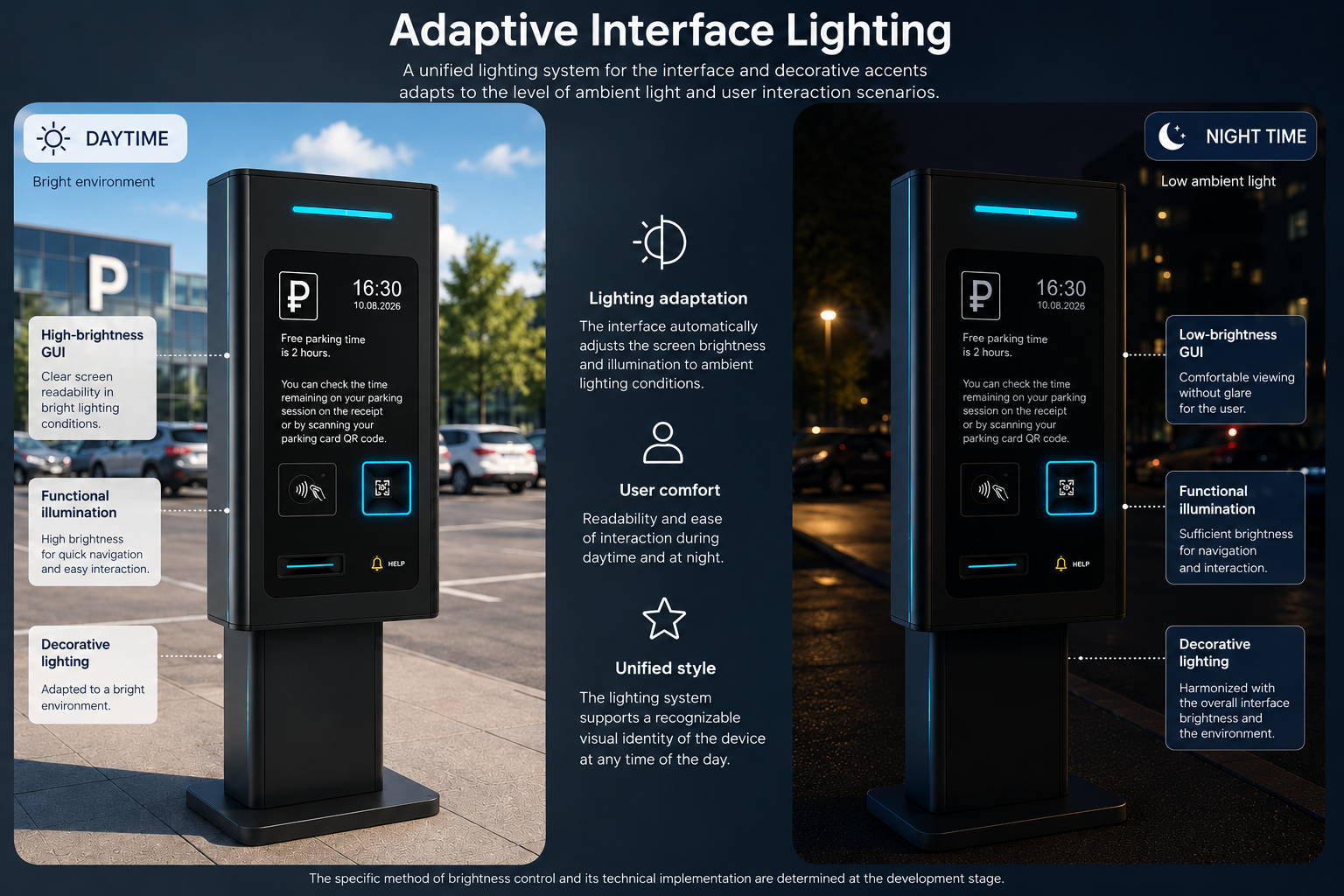
The software controls the sequential illumination of active interaction areas, while an ambient light sensor adjusts the brightness of the display and functional lighting according to external conditions. In daylight, the interface maintains sufficient brightness for visibility. At night, illumination is reduced to provide a more comfortable visual experience without compromising the clarity of interaction.
The result is a more responsive interface in which lighting serves the user rather than functioning merely as a decorative element.
Result:
The concept development process resulted in five independent industrial design directions for CardPark, accompanied by an additional portfolio of functional concepts for future product development. Our exploration covered several levels of the product: visual identity, enclosure architecture, environmental protection, maintenance considerations, interaction scenarios and adaptive interface lighting.
Premium is the feeling that someone has thought through every step for you.
The functional concepts became one of the most valuable outcomes of the project. Protection against accidental mechanical contact, partial shielding from precipitation, sequential illumination of interaction areas and automatic brightness adjustment all represent potential advantages that can be combined with the selected industrial design and developed further during the engineering stages.
Ultimately, CardPark received more than five alternative product appearances. The project established a foundation for selecting a visual direction and shaping a more distinctive product offering for the upper-midrange and premium market segments.
Developing a product for a higher market segment?
We help identify meaningful competitive advantages — from product hypotheses and functional architecture to industrial design and engineering.